The Western Hemisphere is just shockingly small compared to Africa or Asia. And don't blink, or you'll miss Australia.
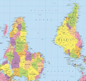
There's also an interesting one there of the world upside down, and one of the true size of countries, which by necessity must distort shape. You may already have seen this map on TV's The West Wing.
Do these maps change your perception of the world?
(Source: msnbc.msn.com.)
No comments:
Post a Comment